


| Client's Comments | "The Nimlok North team involved in the booth design process were unbelievably good listeners. They really took the time to understand our needs and delivered creative, unique concepts that met our requirements within our modest budget. Their focus was really to create something that would work for us, be adaptable, lighter weight and fulfill our needs in the long-term." |
|---|
Design Challenge
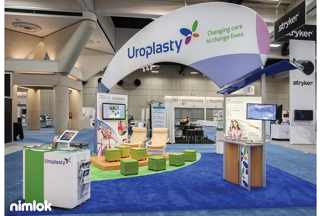
Uroplasty is a global medical device company that develops and manufactures products for minimally invasive medical treatments. Uroplasty was launching a new logo and decreasing booth space at the American Urological Association Annual Meeting, prompting them to replace their larger, outdated 6-year-old exhibit with something new. Nimlok North was challenged to design a booth that would make a splash visually while optimizing a 20x20 space. Nimlok North wanted to incorporate existing components but create a more functional, open space that was flexible enough to use for multiple configurations. Additionally they wanted to make sure the smaller booth space remained highly visible and included sufficient product demo areas.
Design Solution
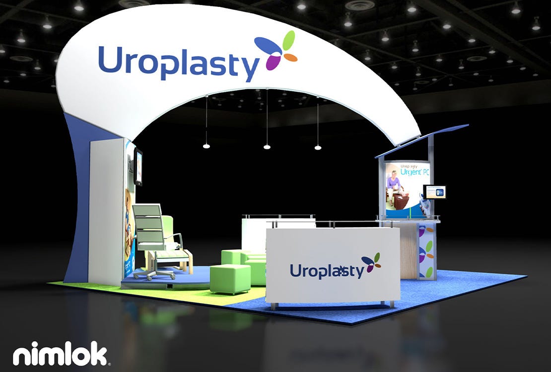
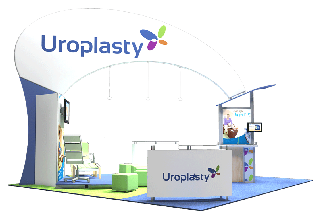
Nimlok North worked closely with Uroplasty to develop a design that incorporated the uniqueness of their new logo, featuring bright colors and distinctive shapes. The design was innovative and modern, featuring a playfully-shaped tension fabric structure that echoed the shapes in the new Uroplasty logo. The arching design created high brand visibility while maintaining an open space for product demos, seating and presentations. By using existing counter and display pieces, Uroplasty was able to invest in custom carpet to complete the design without going over budget. From top to bottom, Uroplasty’s new exhibit utilized versatile shapes and vibrant graphics to stand out on the show floor.
