

| Client's Comments | "One of our primary goals was to showcase all of our sub-brands, while also educating show attendees on each of our offerings per brand. Nimlok Cincinnati addressed our goals and simplified our complex needs into a smart, concise and vibrantly-branded design that both educated and impressed our prospects." |
|---|
Design Challenge
Trilliant Food & Nutrition is a Wisconsin-based food and beverage manufacturer specializing in coffee roasting, single serve cup manufacturing, flavor matching and private label food and beverage manufacturing. Trilliant needed an exhibit with strong brand identity on both the group brand and sub-brand levels. Trilliant’s design also needed to both educate and impress attendees while also having intimate spaces to facilitate in-depth, one-on-one conversations.
Design Solution
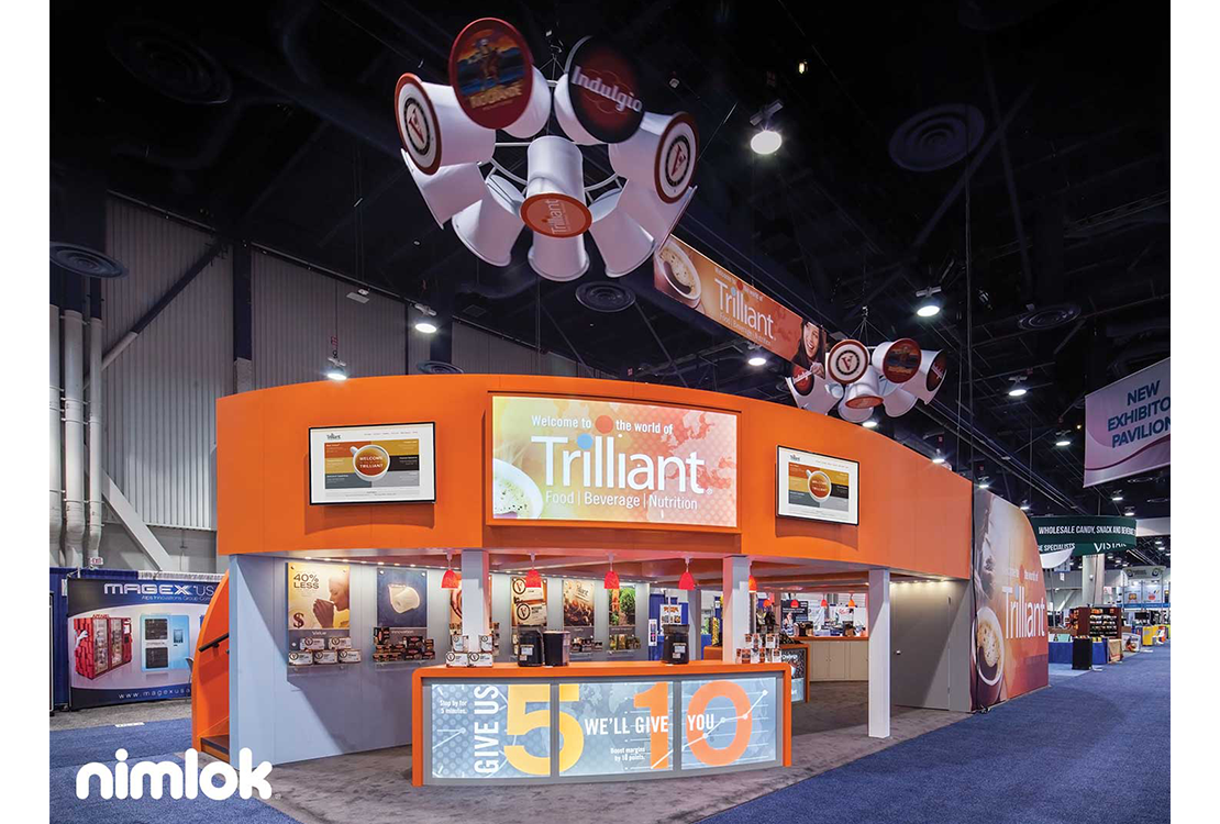
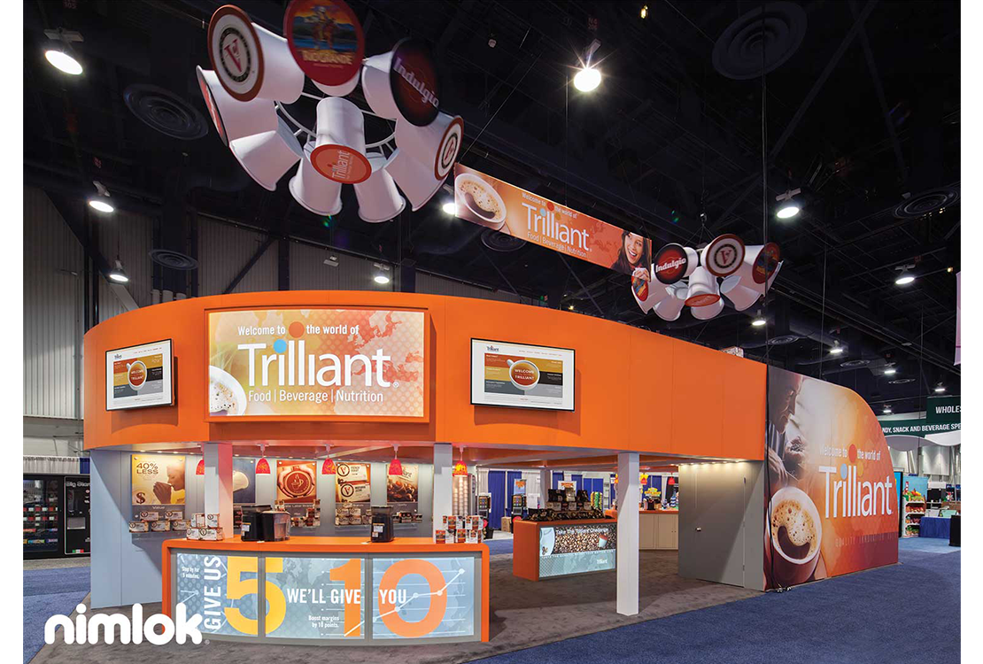
Trilliant partnered with Nimlok distributor Nimlok Cincinnati to design and build an impressive large-scale 20’ x 50’ double-deck exhibit, which incorporated a combination of custom built exhibit structures, a double-deck, fabric-graphics, brilliant lighting and more. Large branded graphics were placed atop sleek curved laminate and wood panels to help broadcast the Trilliant brand across the trade show floor. Illuminated laminate-graphics and “stations” supported Trilliant’s efforts to educate attendees on product brands that fall under their company umbrella. Each “station” contained illuminated branded imagery with shelving underneath displaying the products associated with the respective brand helping educate visitors on their offerings. The interior of the exhibit featured custom-built backlit cabinetry that aided in the presentation of Trilliant’s coffee products. A front-facing reception counter complete with backlit graphics served as a space for both visitor-registration and product-demonstration. Aisle-facing graphics and monitors promoted product line imagery and messaging to further educate attendees browsing the trade show floor. Lastly, above the on-the-floor display, a second floor deck helped foster a more intimate space where prospects and booth staff could meet and establish connections. Trilliant’s exhibit seamlessly pulled off a large captivating branded space that effectively represented a multitude of sub-brands while also giving prospects a more warm and private setting for conversation. Trilliant was so pleased with the exhibit that they are consulting with Nimlok once again to create additions to their traveling 20’ x 50’ exhibit. These additions would include K-cup inspired hanging signage, a 16’w x 6’h double-sided pillowcase graphic and two 8’w x 4’h curved backlit boxes that will be attached to the current panels. These additions will help bolster the already standout exhibit.
