


| Client's Comments | "In 2013 Nimlok St. Louis designed a large-scale exhibit that helped communicate the merger of Purolator with parent company Mann+Hummel. When new brand standards were introduced in 2015, Purolator needed a new exhibit that reflected the changes in brand direction. Nimlok St. Louis’ history and previous record of successful projects with our client and their various brands gave us deep insights into their needs and the ability to meet them accurately" |
|---|
Design Challenge
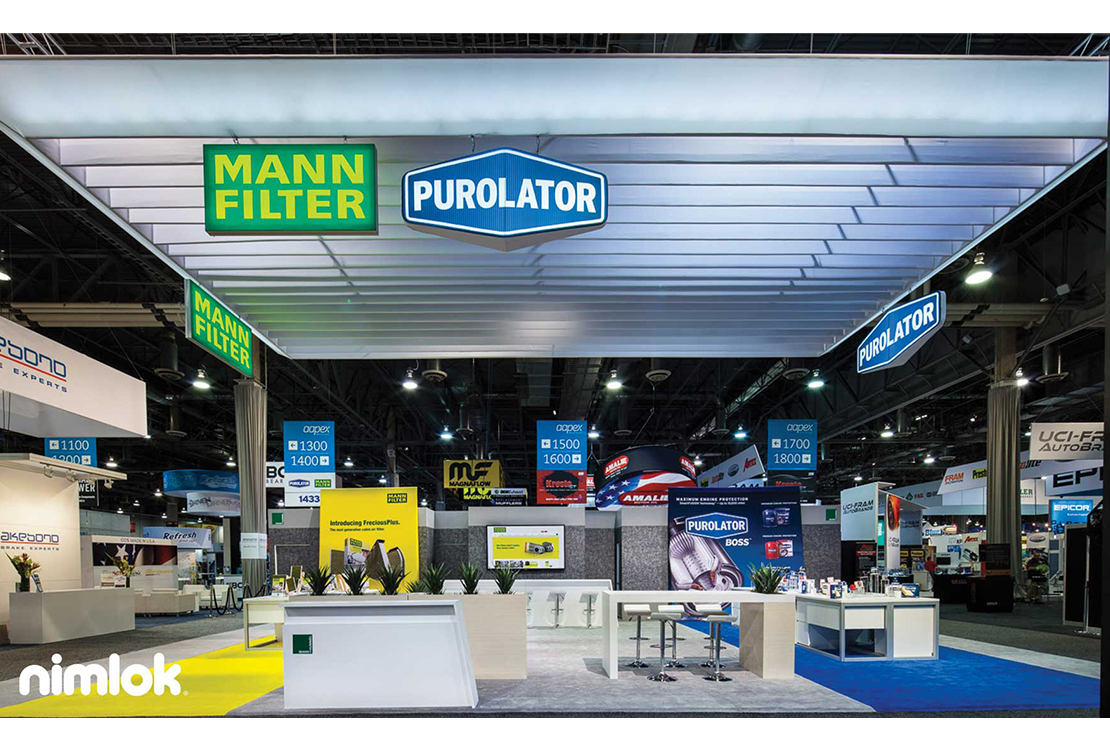
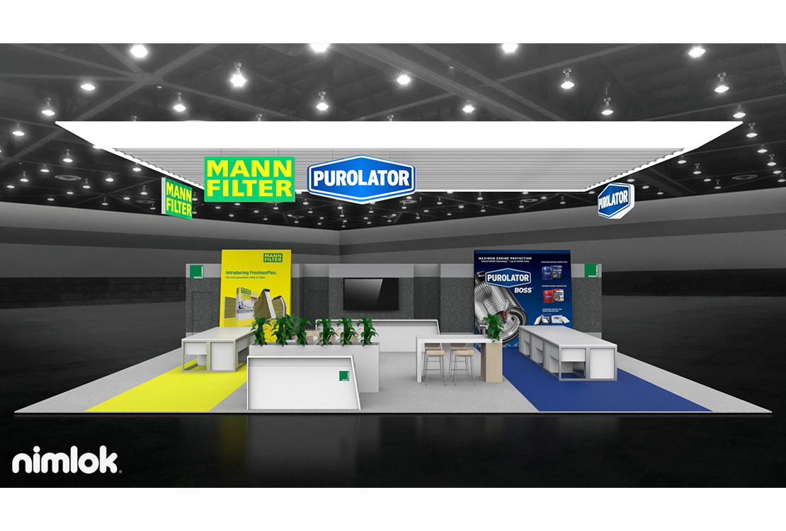
Purolator Filters is a US-based automotive accessory manufacturer specializing in air, oil and carbon filters, as well as intake systems and cylinder head covers. In 2015 Mann+Hummel, Purolator’s Germany-based parent company, issued new brand standards for all divisions. Each global subsidiary was tasked with aligning their marketing assets with the new brand direction. Purolator’s exhibit needed to combine the booth layout and design its parent company created to establish brand unity, and it also needed to add private meeting areas, public display areas, guest seating and informal meeting spaces into the exhibit. In addition, Purolator needed to feature both the Purolator and the Mann+Hummel brands.
Design Solution
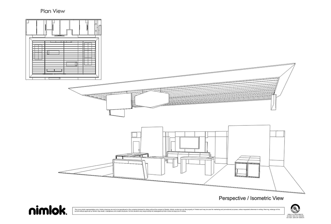
Exclusive Nimlok distributor, Nimlok St. Louis, partnered with Purolator Filters to design and build a 40’ x 40’ custom exhibit. The exhibit’s floorplan and layout were borrowed from Purolator’s German parent company to accommodate the need for brand unity. A 40’ x 50’ rectangular filter-shaped spanned the exhibit space, additional hanging signs featuring the Purolator and Mann-Hummel logos hung on all sides of the island exhibit. fabric hanging structure adorned with hanging signs broadcasted both the Purolator and Mann+Hummel brands across the convention hall. Room partitions built into the exhibit backwall offered both room for storage and private meeting spaces. The center of the exhibit was left open for attendee traffic flow. Guest seating areas provided informal meeting space where staffers could engage visitors in casual settings. Distinct yellow and blue “stage” areas delivered a clear visual distinction between Purolator Filters and Mann+Hummel while communicating brand unity too.
