


| Client's Comments | "Designing an exhibit around Code 3’s products resulted in a dramatic increase in in-booth engagement. Our team loved breaking the mold with this exhibit and seeing such immediate results." |
|---|
Design Challenge
Code 3 needed an exhibit that could display its full range of emergency and warning vehicle lighting, sirens, beacons and controllers in a way that allowed users to interact with the products. Demonstrating products and allowing booth visitors to play with the products directly was central to Code 3's exhibiting and sales strategy.
Design Solution
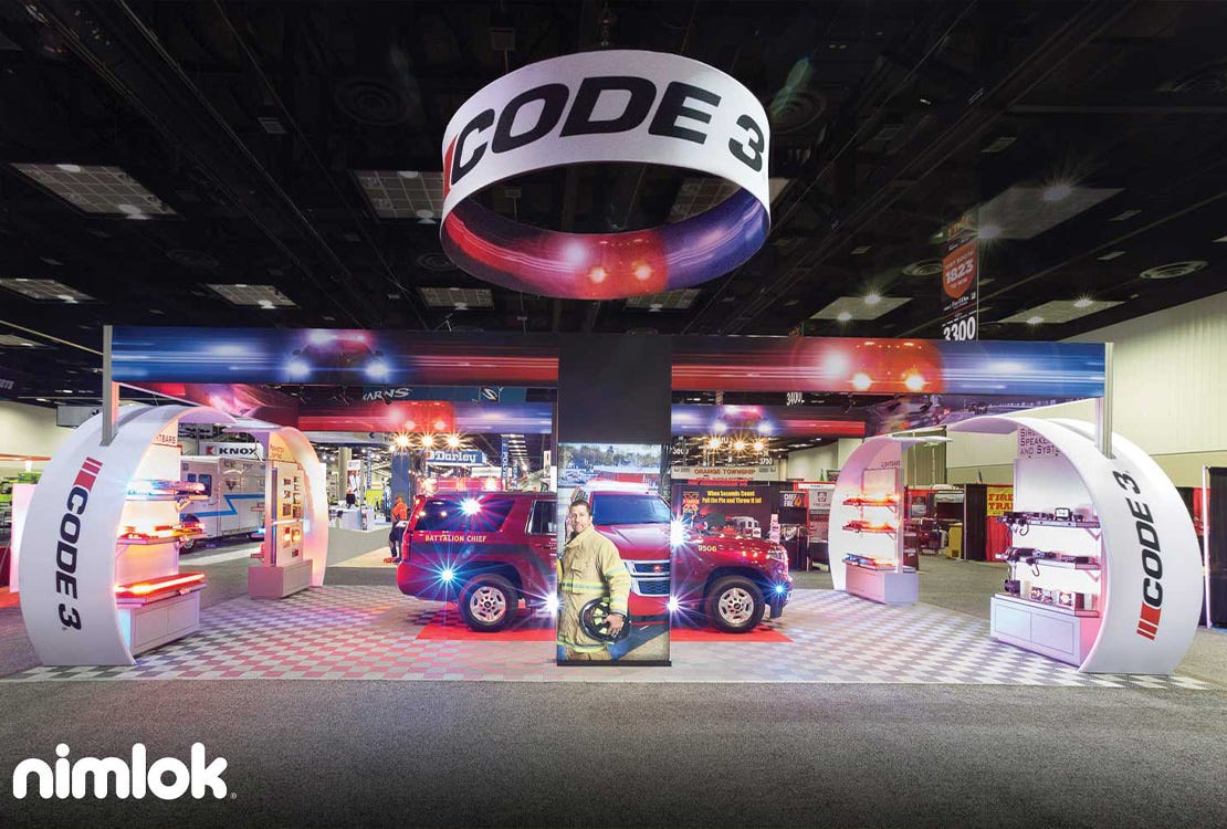
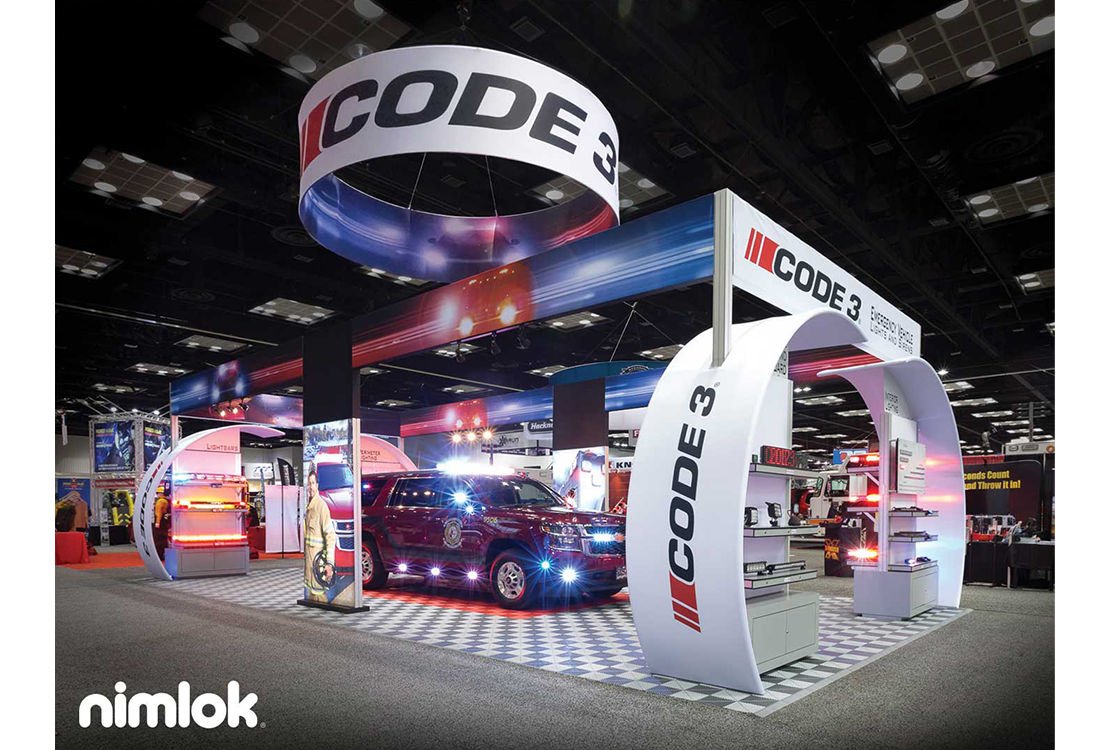
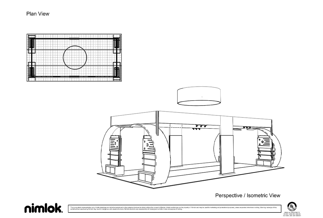
Nimlok St. Louis designed a custom modular exhibit that featured four aisle-flanking product display kiosks. These kiosks were constructed using heavy-duty aluminum extrusion, which served dual purposes of supporting heavy products and providing discrete storage of wires and cords in the hollow middle of the extrusion.
Configuring product displays at the corners of the exhibit allowed show attendees to view, touch and demo products right from the aisles. This also left the exhibit space largely open. Inside this open area, Code 3 displayed a full-size emergency service vehicle, decked with Code 3 products, and had ample space for booth visitors to move around the vehicle and view staff-run demonstrations.
Additionally, the openness of the space will make it easier for Code 3 to reconfigure the exhibit to fit a smaller space in the future.
Finally, stylish elements, such as curved fabric accents around the product display kiosks, backlit floor banners, elevated graphic banners with colorful graphics and a contrastingly bold hanging structure visually distinguished Code 3 from competitors on the show floor and attracted attendees from all directions.
As a result of its new exhibit, Code 3 saw an increase in booth visitors, staff-run demonstrations and sales qualified leads at the show and are making plans to use and/or modify the exhibit for future events.
